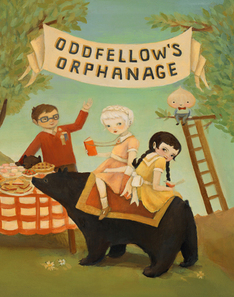
 Oddfellow’s Orphanage by Emily Winfield Martin
What do an onion-headed boy, a child-sized hedgehog, and a tattooed girl have in common? They are all orphans at Oddfellow’s Orphanage! This unusual early chapter book began life as a series of full-color portraits with character descriptions. Author/illustrator Emily Martin has fleshed out the world of Oddfellow’s with a cozy collection of tales that follows a new orphan, Delia, as she discovers the delights of her new home. From classes in Cryptozoology and Fairy Tale Studies to trips to the circus, from Annual Hair Cutting Day to a sea monster-sighting field trip, things at Oddfellows are anything but ordinary . . . except when it comes to friendships. And in that, Oddfellows is like any other school where children discover what they mean to each other while learning how big the world really is.
Three things to like about this book as a reader
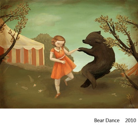
1. What drew me to the book initially was Emily’s gorgeous artwork. It has a distinctive and retro feel, reminding me of the 1930s era needlework and quilts that my mother-in-law makes. Illustration used to be the norm in middle grade fiction, but lately the books with spot illustrations throughout tend to be very loose and cartoon-like in their style. Oddfellow’s Orphanage has carefully rendered art with a classic feel on every page.
2. The book also has a gentle and distinctive and retro sound. Each chapter is its own vignette, with a conflict simply presented and sweetly resolved. The book follows the cycle of a year through the eyes of the newest orphan Delia. Every chapter heading is faced by a portrait of a child or teacher from the orphanage and a brief account of how they came to reside at Oddfellow’s.
3. This is a book that begs to be read aloud by a grandparent. It’s perfect for a young tender-hearted reader and anyone looking for a break from the pizazz and relentless pacing of many contemporary novels.
Something to think about as a writer
One of the reasons I picked this book up is that I have an off-again on-again project for younger middle grade readers. Oddfellow’s Orphanage is so geared toward the visual it’s making me think about how I would want my own story to be illustrated–which elements I should describe myself and which I should leave for the illustrator to illuminate. How many illustrations per chapter? What would be best served by spot art and what would make a good full page illustration? I know that most of those choices will belong ultimately to the illustrator but I’m going to make my next revision with the visual more in mind.
How I found this book
It was my pleasure to appear with Emily at a teachers’ book event at the Vancouver Barnes and Noble last month. I bought a copy of her book for my mother-in-law. We are both published by Random House. I make no claims whatsoever to objectivity in my reviewing.
You can read more about Emily and see many examples of her artwork at her website.

